Jean-Remi
Thursday, January 15, 2026
In 2024, Notion released one of its best features to date: native charts. Notion Charts allow users to visualize their data through custom charts.
This opens the door to endless possibilities, enabling you to visualize your finances, sales, working times, and much more. Most importantly, they provide insights that are difficult to glean from other database views.
In this article, we will explore how to create a chart in Notion, the different types of charts and how to use them for specific use cases.
How to Create a Chart in Notion?
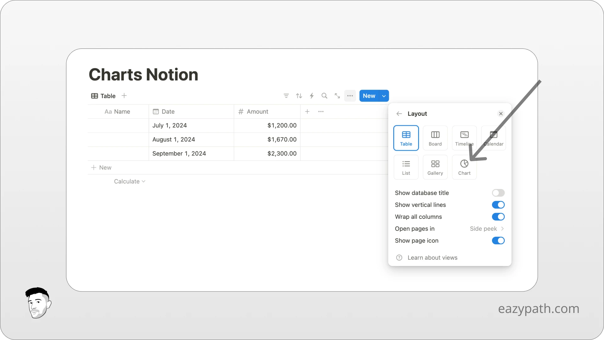
First of all, you will need a database with several properties to be able to visualize your data. For this example, we will create a simple database named "revenue" that shows the amount earned each month. The database will have 2 properties: a date and an amount in dollars.
From this database, simply create a new view. When creating a new view, you will see a new option at the bottom of the list called "Chart." Click on it then click on Edit chart.
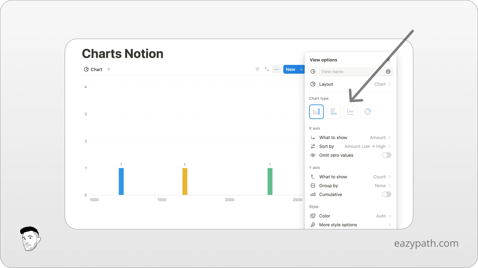
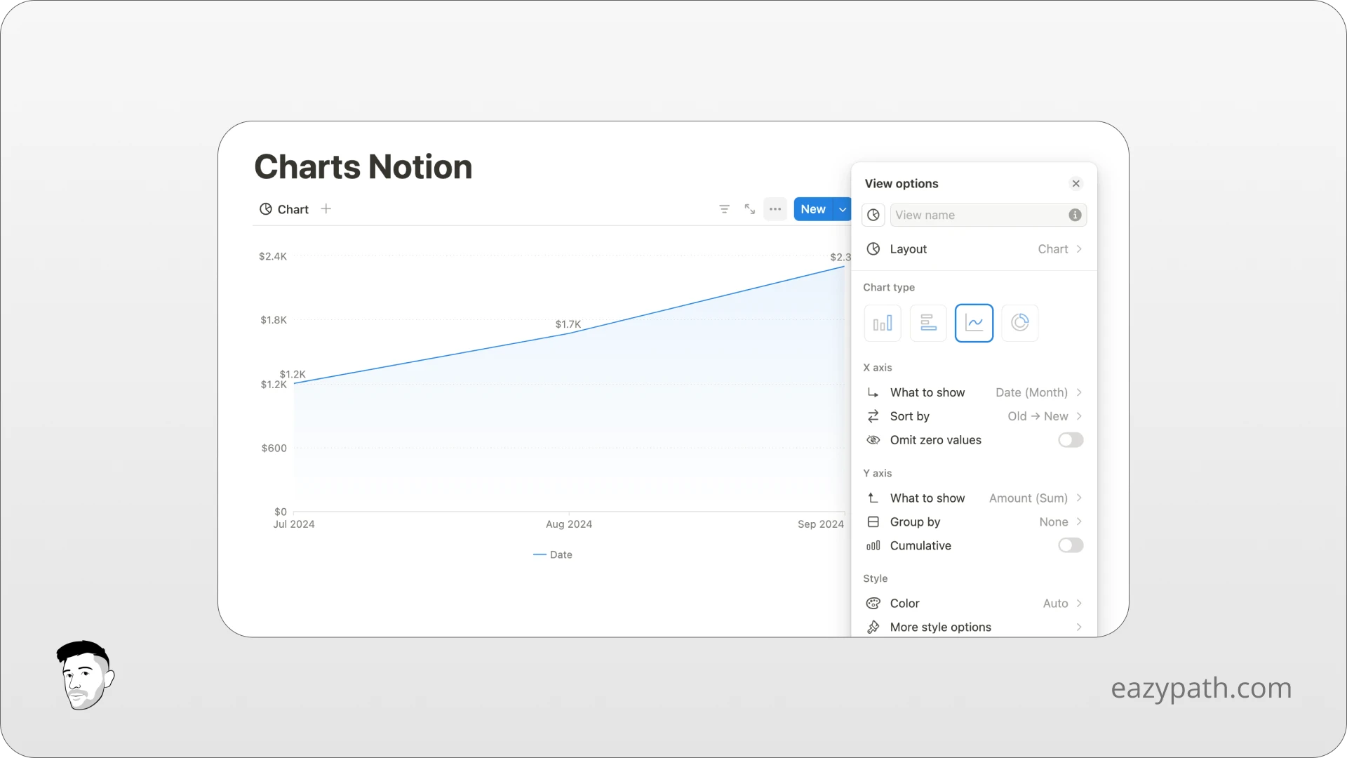
You will see a list of options giving you the different types of charts you can create. From there, you can simply select which Notion charts you want to use: vertical bar, horizontal bar, line, or pie chart. Let's choose the line chart for this example.
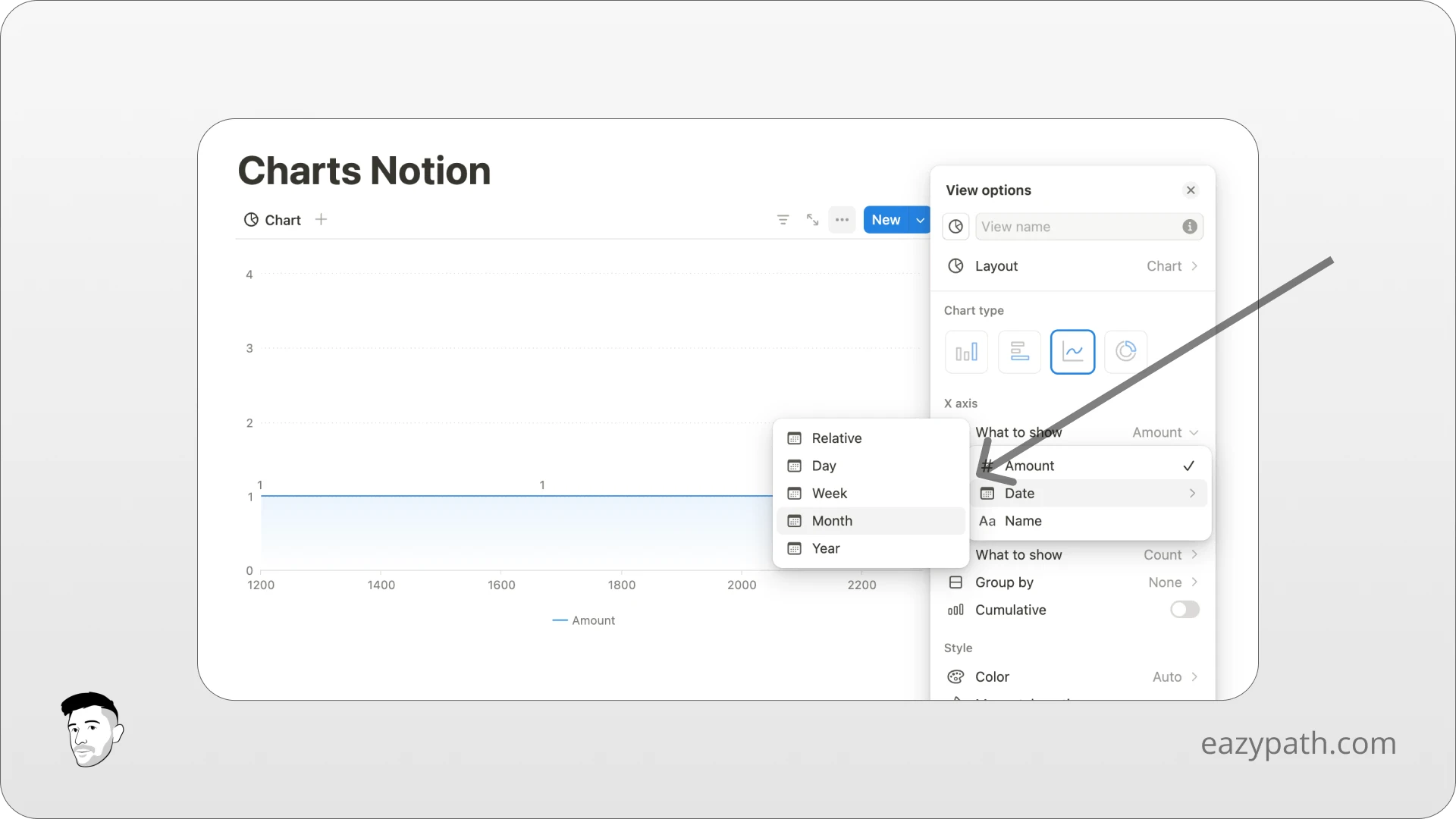
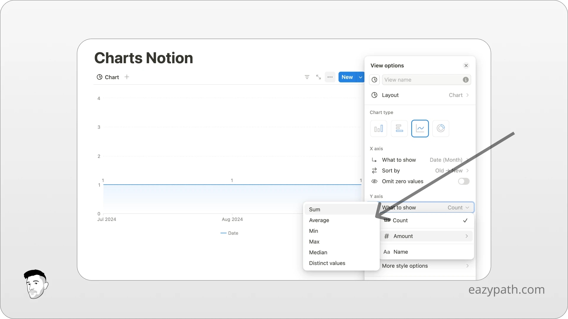
From there, you will need to select on the X-axis and Y-axis the properties you want to display on the chart.
In this example, the database shows the revenue earned each month in dollars. So it would be logical that the X-axis displays the date and the Y-axis displays the amount in dollars.
Let's select the date on the X-axis and display it by month.
For the Y-axis, let's select the amount and display the sum.
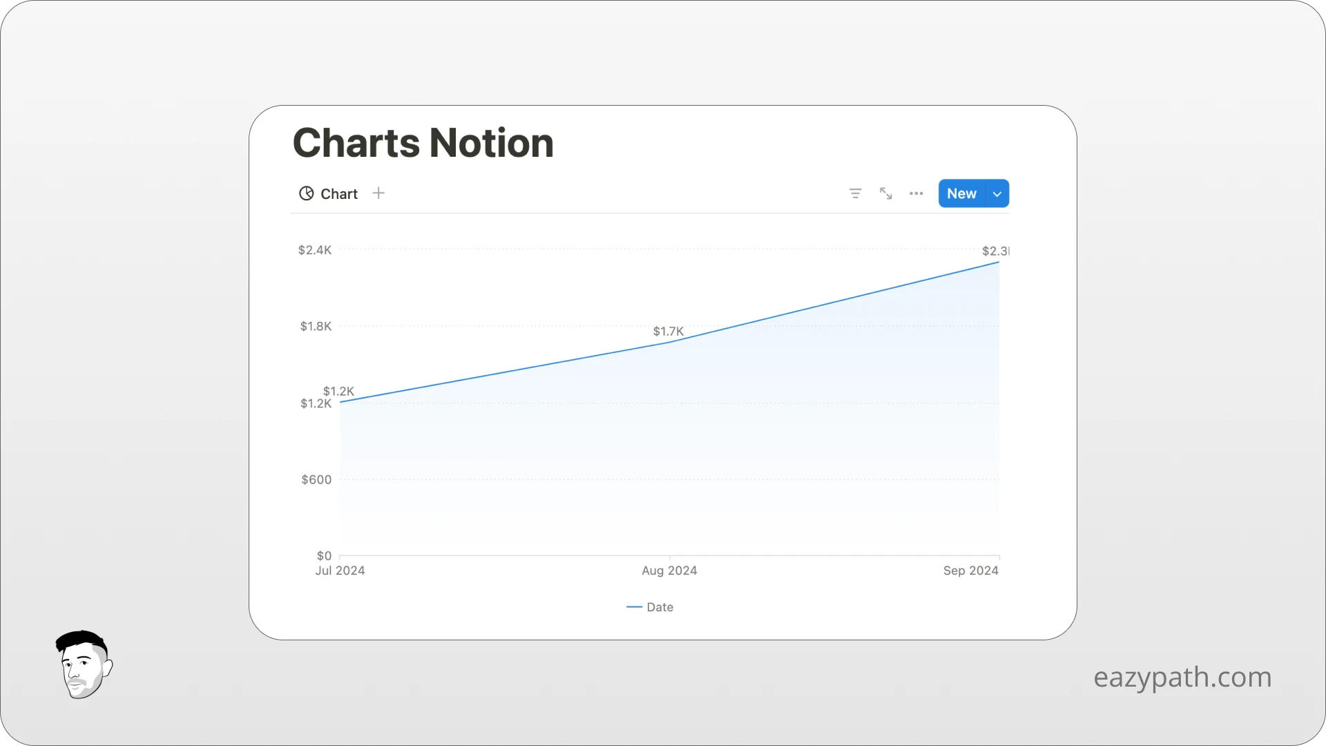
That's it! We have successfully created a chart in Notion for our database.
What are the Different Types of Charts in Notion?
Now that we saw how to create a simple chart in Notion, let's overview the different types of charts you can create in Notion.
The Pie Chart
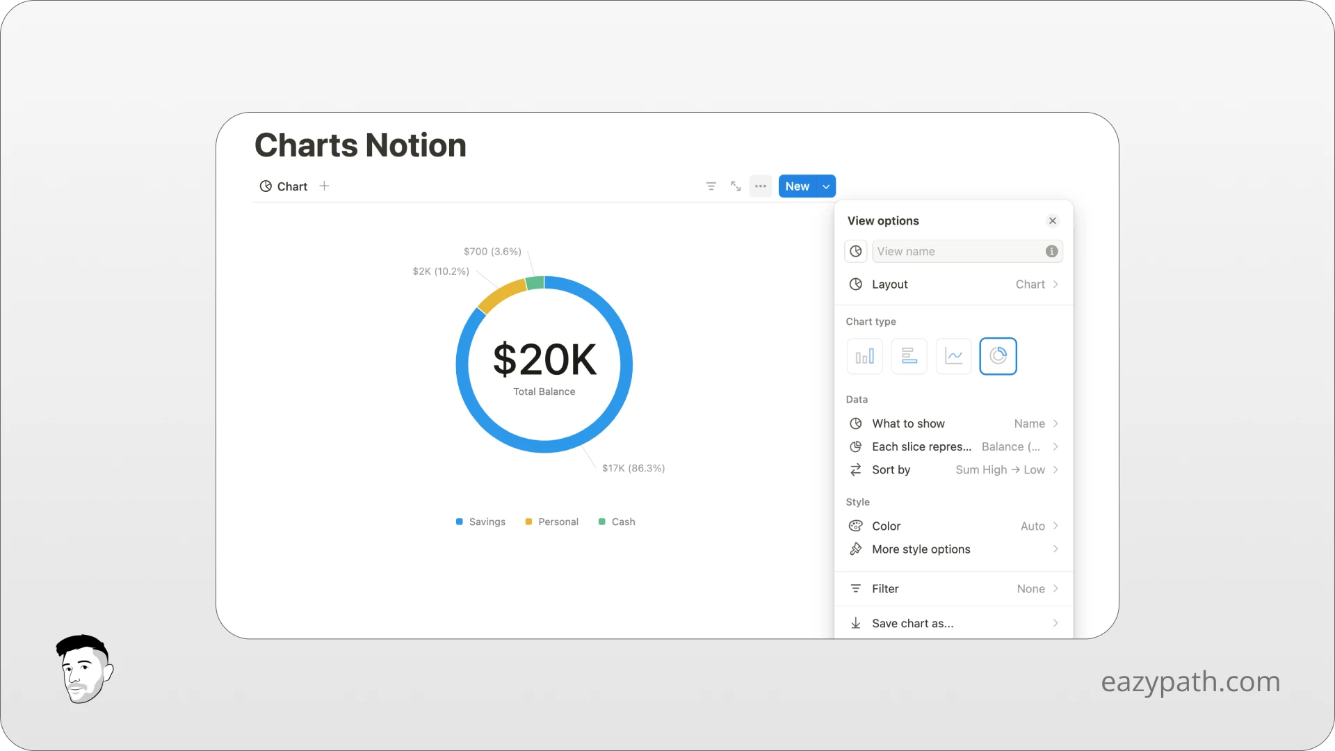
The pie chart, referred to as a Donut in Notion, is ideal for displaying proportions and distributions of a whole.
When creating a pie chart, you can set:
What to show: The property you want to visualize
Each slice represents: How you want to group the property
Sort by: How the slices are arranged, beginning from the 12 o’clock position
The Vertical Bar Chart
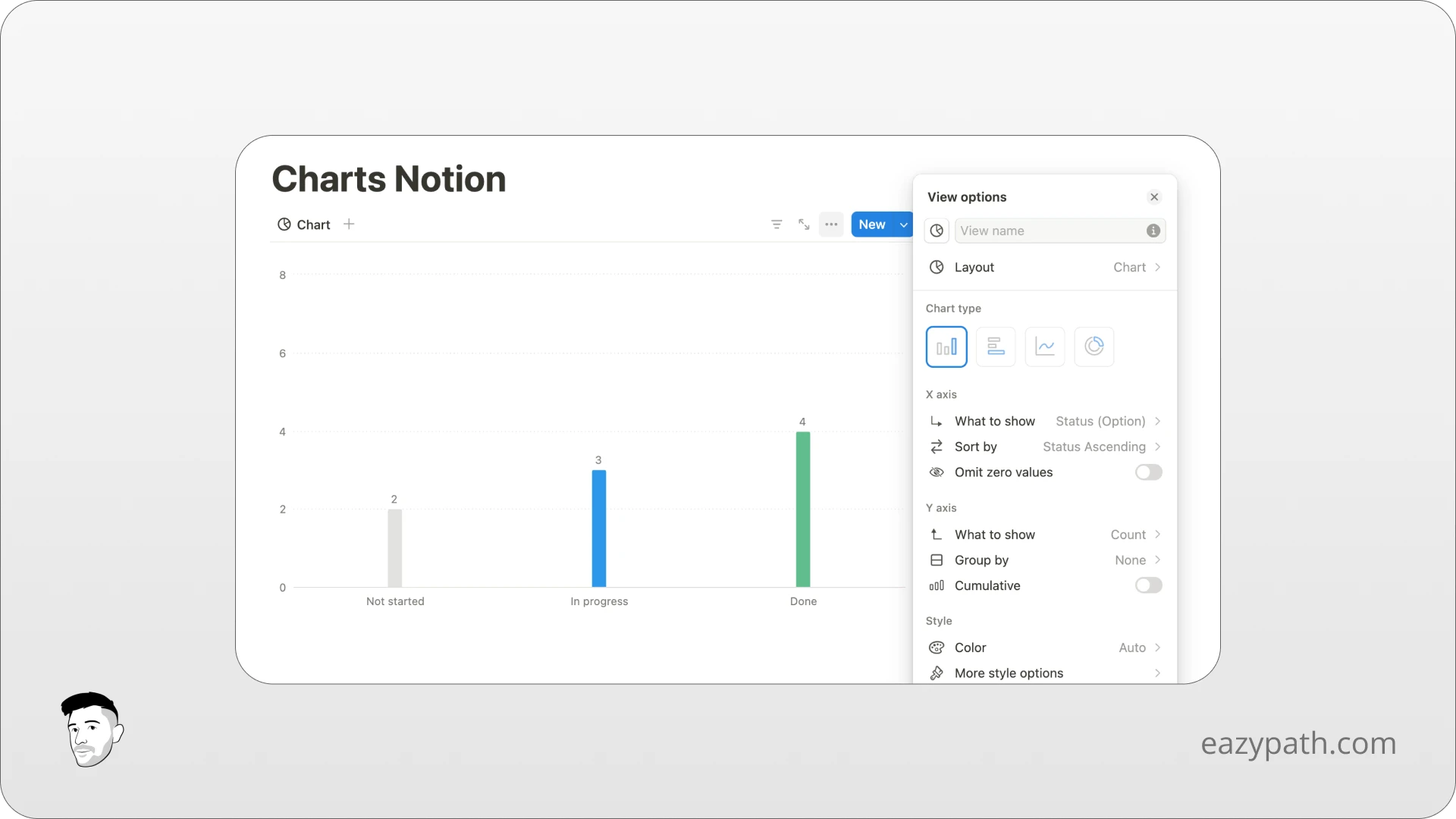
A vertical bar chart is ideal for comparing quantities across different categories or visualizing the number of tasks done and undone.
When creating a vertical bar chart, you can set:
X-axis:
What to show: The property by which you want to categorize your data
Sort by: The order in which to display the properties on the X-axis
Omit zero values: Toggle on or off to remove zero values
Y-axis:
What to show: The property that serves as the count
Group by: Click to subdivide your Y-axis values by a different database property
Cumulative: Toggle to add Y-axis together, which is useful for values that change over time
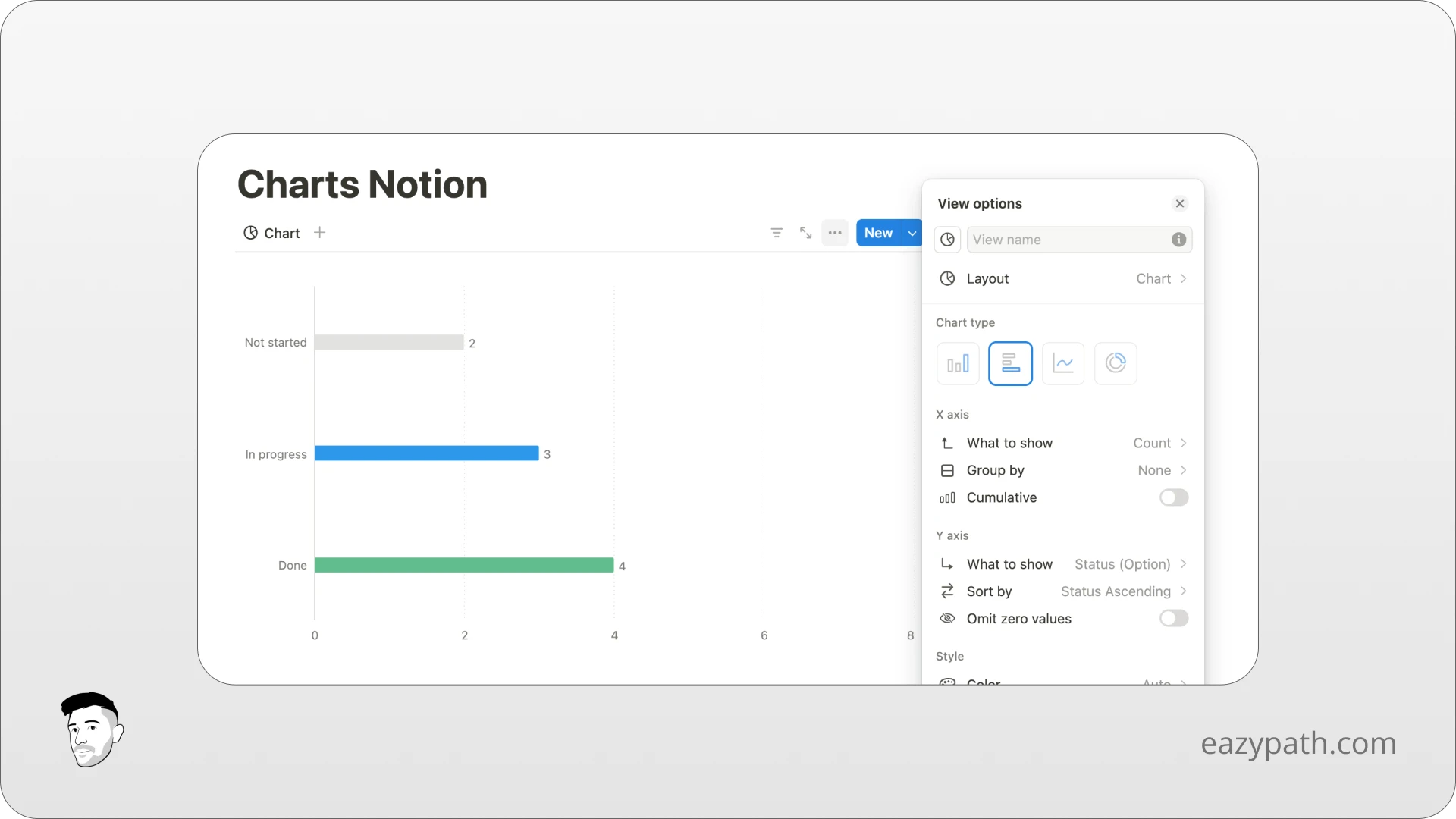
The Horizontal Bar Chart
A horizontal bar chart is really useful when you need to compare multiple data sets on the same graph.
The properties to set are basically the same as for the vertical bar chart.
The Line Chart
The line chart is the most accurate way to show changes over time, such as revenues, weight evolution, or task completion rates.
When creating a line chart, you can set:
X-axis:
What to show: The property used to categorize your data, often a date property for line charts.
Sort by: The order in which to display the properties on the X-axis
Omit zero values: Toggle on or off to remove zero values
Y-axis:
What to show: The property that serves as the count
Group by: Click to subdivide your Y-axis values by a different database property
Cumulative: Toggle to add Y-axis together, which is useful for values that change over time
How to Customize the Notion Charts?
Maybe you already noticed the "Styles" section in each chart created. It's because each chart offers the possibility to customize its style, like the colors, the size, and more.
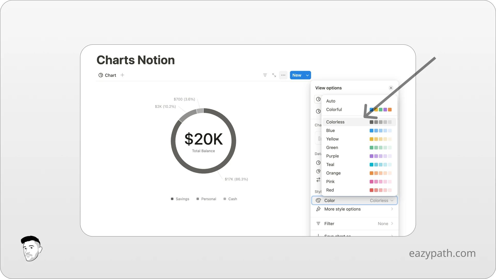
The Color of the Chart
On each chart, you can choose and change the color according to the design of your workspace. Are you someone who is more aesthetic? Then you can create really colorful charts. Are you someone more minimalist like me? Then there is also this option.
Simply choose the color option in the Styles section and select your preference.
Other Styles Options
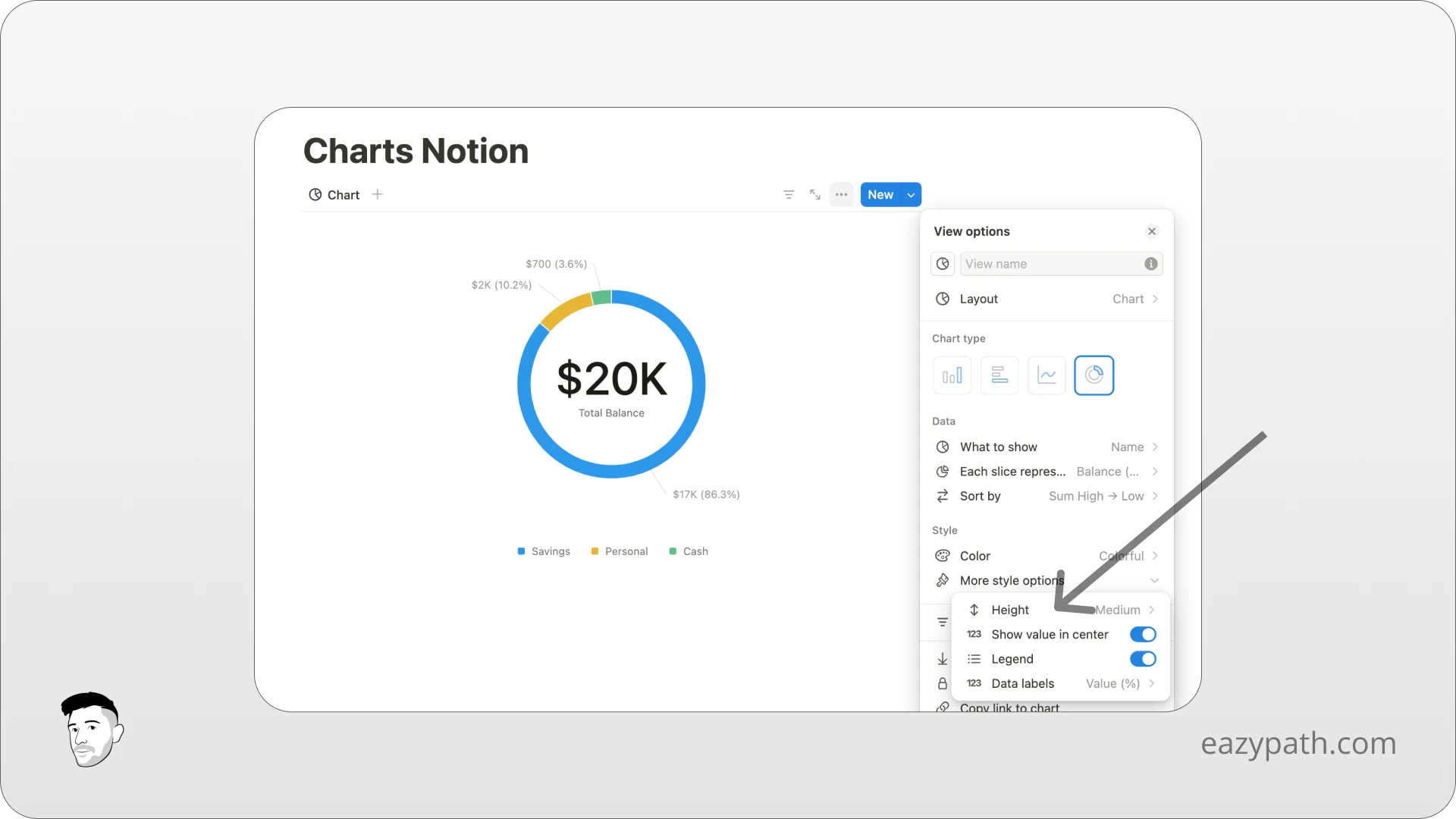
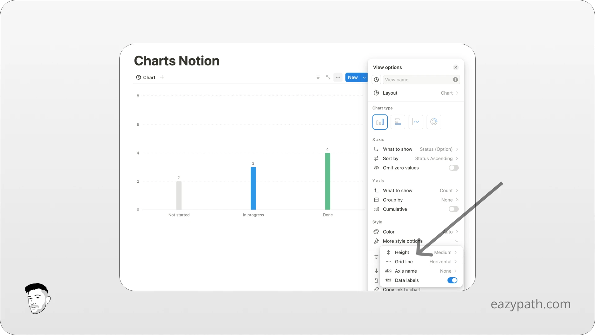
Each chart offers various options. However, the following options are common to all charts:
Height: Allows you to choose the size of your chart, from small to extra large.
Data Labels: Enables you to display or hide values on the chart.
For the pie chart you will also find:
Show value in center: Toggle it if you wish to display the value in the center of the donut
Legend: To display or not display the legend
For the vertical and horizontal bar chart, you will also find:
Grid line: to display a line on the X-axis, Y-axis, or both
Axis name: to display the X-axis name, Y-axis name, or both
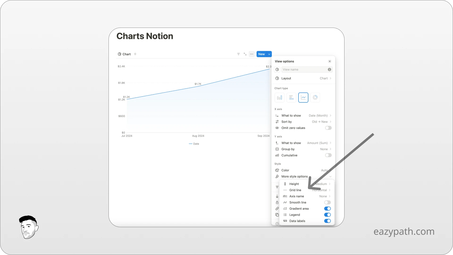
Finally, on the line chart you will find:
Grid lines and axis names like for the bar charts
Smooth line: to display the line without corners
Gradient area: to display or not a gradient area under the line
Some Practical Application of Notion Charts
Throughout this article, we've seen how powerful Notion charts can be for visualizing your data. Now, let's explore some practical applications for using Notion charts.
Finances
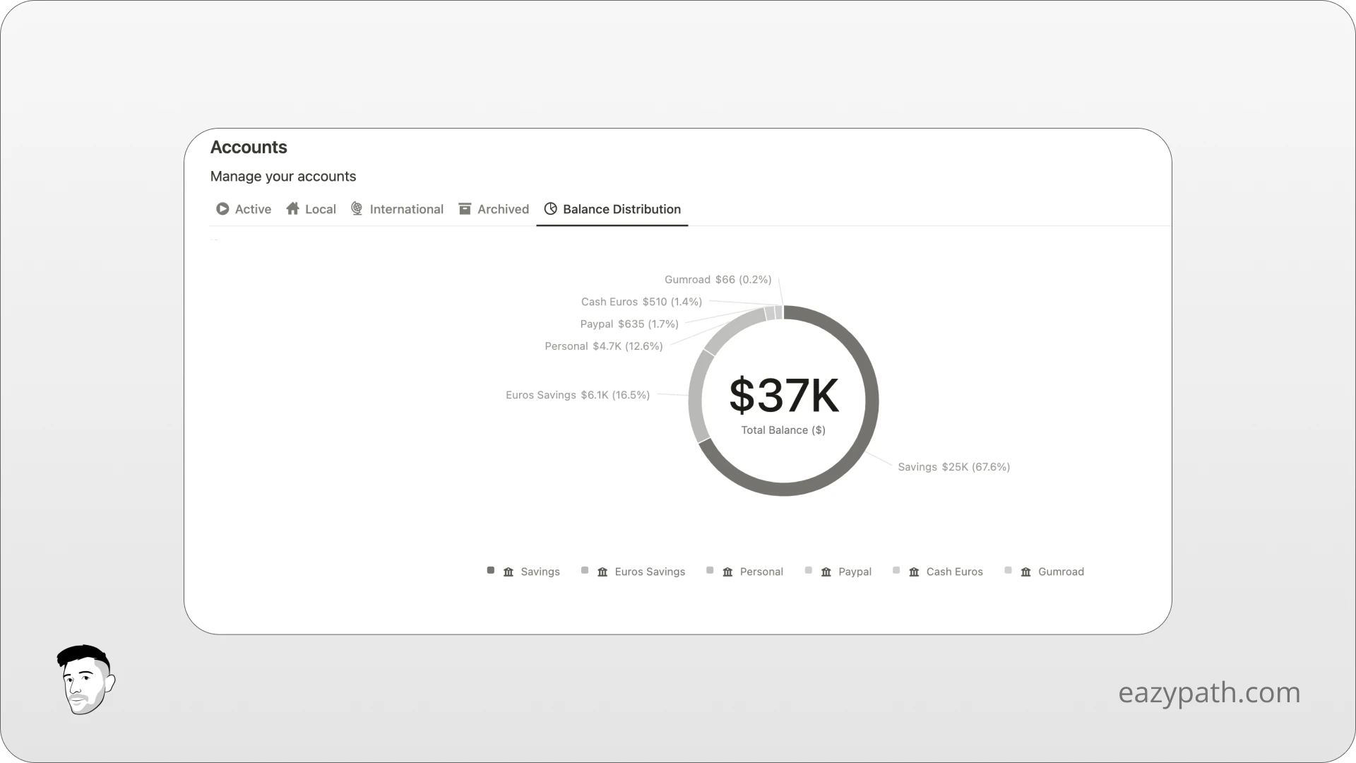
Notion charts can be really useful in finances. You can display the distribution of your accounts, show the evolution of your expenses or revenue over time, or even see which area of life you spend the most on each month.
I have included tons of Notion charts in my finance tracker (view finance tracker)
Project Management
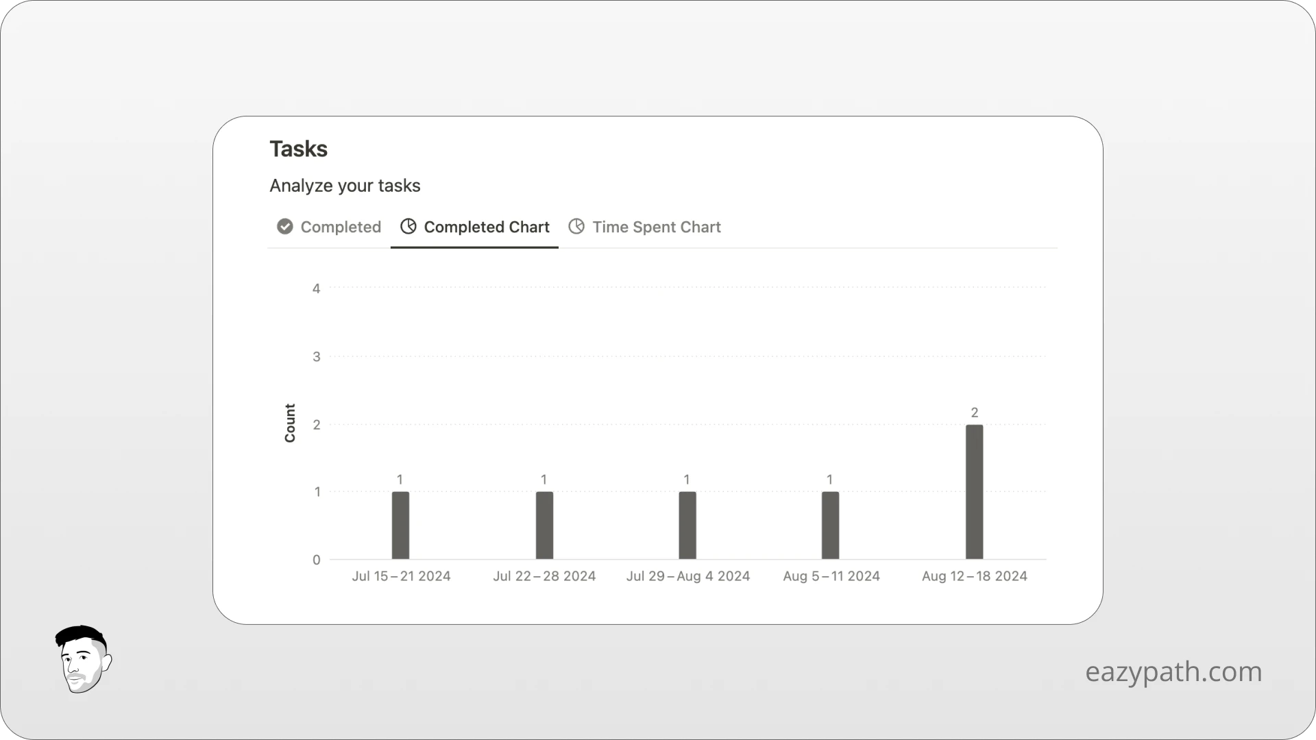
In project management, you can create a bar chart that displays the number of tasks completed per project or per dates.
Health
You can even use Notion charts for health measurements, such as tracking your activity time or the evolution of your weight over time.
I have included the evolution of weight chart in my workout tracker (view workout tracker).
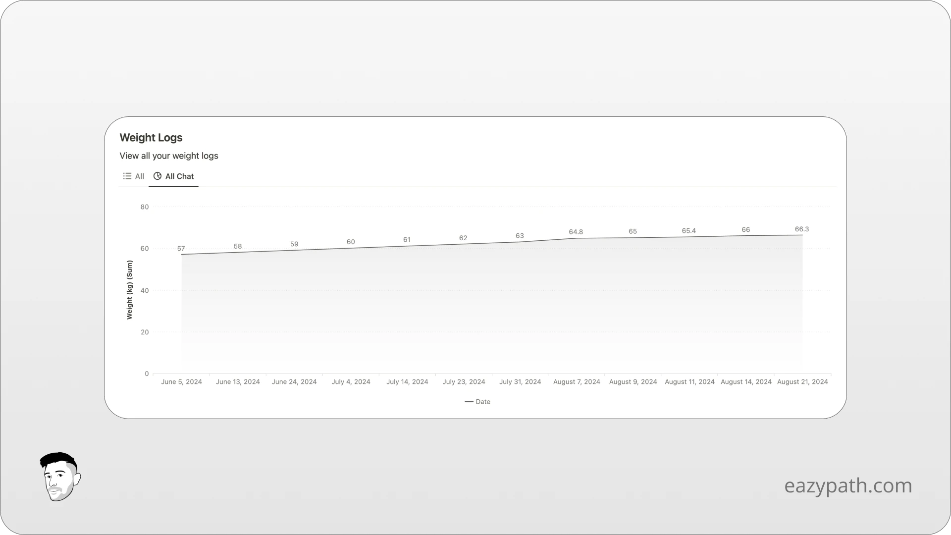
Of course, Notion charts can be applied in many other areas such as sales tracking, performance analysis, and much more.
Conclusion
Notion charts are a game-changer for users looking to visualize data effectively. Whether for personal projects, finances, team management, or health, the ability to create and customize charts boost productivity and insight.
If you are ready to start your Notion chart journey now, you can create a Notion account and dive into its full potential.

Are Notion charts included in the Notion free plan?

Is Notion planning to release new chart types or features in the future?

